There is only 2% of App Store users open the “read more” section. The 2% of users are curious about the content and offers of a particular app. Their curiosity will lead to something beneficial for your business.
Also, this doesn’t mean that you shouldn’t be meticulous about this part. You still need to write a kickass full description of your product on the App Store. The description of the app plays a significant role in success. When you cannot write something impactful, your business app will not captivate the audience.
The point is, further to say, this figure solidifies the idea that App screenshots should be well thought out, attractive, and enticing. These are the essential characteristics that your mobile app should contain. Also, this is how you can make mobile marketing success.

You can do this business strategy to connect to the audience (prospective customers) through mobile devices. However, this is somehow different from the usual desktop-based marketing where business people are targeting PC users. With mobile marketing, you are focusing on the users of smartphones and other smart gadgets.
From the App screenshots alone, people should already be convinced to buy or download the digital product. But what are the elements of a good screenshot? Also, this is the focus of this blog post. You will know here the essential aspects of in-app store screenshots. Remember that the screenshot images are vital to attracting people who are fond of visuals.
Elements of app screenshots
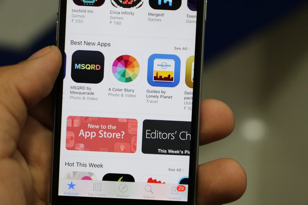
Before you start creating the design for your App Store screenshots, it would be beneficial to browse through the current digital products up for download. Check the Apple App Store and Google Play Store to research relevant apps. When we say relevant apps, it means those apps related to your business’s focus.
Doing this will give you a nutshell or an idea of what works. Hopefully, the browsing will also inspire what you can do for your digital product. You aspire to hit success, right? Also, this might be a very crucial thing to realize, but understand that this is attainable. To attain this, you need great images to visualize the content and concentration of your app.
By browsing the App Stores, you can immediately pinpoint the good screenshots from the bad. It also helps that the digital stores provide a list of the top-selling apps for the period. You can use specific keywords.
![]()
Also, this is how app optimization works, as is the same with the more conventional search engine optimization. The use of keywords is popular in this sense. So, kindly input relevant keywords on Google or Apple and let the results guide you until you understand the whole thing.
Spend more time creating the screenshots rather than writing the description. Again, this is not to say that you should not put your best foot forward when writing the description—you absolutely should! A grammatically problematic description will also be a point against you.
However, the screenshots happen to be essential in terms of attracting app users. Let’s now move on to the important part—what makes a great App Store screenshot?
1. Creativity
Duh!
In whatever realm, if you want to attract people, you need to have a lot of creativity in you. In this case, your screenshot should be creative. Why is this so? Most people love to see creative and aesthetic things. In terms of app store screenshot images, you have to ensure that the creativity aspect is present on a high level.
When it comes to digital products, creativity is not always open for interpretation. It’s not like art, where what is attractive can be subjective. When it comes to application screenshots, there are just essential elements that have standard criteria.
For example, screenshots have texts. These texts should be legible and easy to read. Think of this! You want to visualize the content and message of your brand, right? That is why the texts in the screenshots should be readable and visible enough. You have to remember that screenshots are small. Also, you can see them on smaller devices like the iPhone or iPad. These should guide you.
Therefore, you should not put many texts on each of the screenshots, and each letter should be easy to read. There’s also the matter of the images. They should also be clear, and the content should not be up for interpretation.
However, you have to show the people what they get if they buy or download your digital product. The images you will use in the screenshots are crucial. You have to be smart about what to showcase here. Do not mar the product images with unnecessary things like emojis or even unnecessary expressions. You have to highlight the things people will see all the time when they purchase the digital product.
Margins, by the way, are very helpful in making sure that every aspect of the screenshot is in place. It’s also neater that way. Sometimes, people overanalyze creativity. Furthermore, simplicity is creative.
Also, this holds true with screenshots. You don’t have to put too many things on the screenshot to make it attractive. People don’t have time to analyze the screenshot. Just provide a simple image of what people will see or expect from the app and give a few words to accompany the image.
It’s just as simple as that. Don’t overwhelm the users with too many things on a single screenshot. It will just look cluttered. Use simple words and be direct.
2. Technically Correct
There are specific technical considerations when making a screenshot for the App Store. The technical aspect can be a burdensome thing for you. But you have to understand this for you to hit success.
To put the context clearly, you can find appropriate pixel sizes for different devices. You need to get this right, or Apple and Google will reject your mobile application screenshots right away during the listing. Of course, you do not want this to happen, do you?
That’s precisely why you need to get this right, or you will not be allowed to showcase your screenshot. It’s the same for the videos, by the way. The App Preview should only be high-quality footage. Anything less will be rejected.
3. Amplify the Message
From the first screenshot, your message should already be loud and clear. Are you wondering what the point of the digital product is? Why should people download this app? Why is it good?
There is a report that stated that people are only on the App Store page for seven seconds. In those seven seconds, they would either decide to know more about your product or move on. With that limited time to convince people your product is good, it’s safe to say that you have to sell it to them in the first screenshot.
Grab people’s attention and let them know what your product is about. Always consider that people don’t necessarily have the time to dilly-dally on the app. Don’t tease them. Just let them know what’s up with the app.
4. A Story Would Be Good, Too
While every screenshot should be a standalone element of your digital product, it would benefit all the screenshots that tell a single story. It truly helps when people feel connected to your digital product. That happens when there is a story because that is always the great connector.
People bond over stories—whether they are shared or not. It’s easy to relate to things when a story is involved, considering that we all have stories to tell. While the first two screenshots are the vectors of the digital product, allow the other screenshots to provide context and be amazing supporting elements.
If the first couple of screenshots are crucial at providing the message. Furthermore, the rest of the screenshots should showcase the beauty of the digital product through stories. It is widespread now to see the first two screenshots of an app to be connected. Also, this is what you called a “split” screenshot. You have to see them together to make sense.
The good thing is that you usually have four screenshots together on the App Store. It allows you to be more creative with a much larger screen—the two split screenshots.
Conclusion
Perhaps your App screenshots are fantastic, in the general sense of what makes things attractive. However, if you don’t follow the App Store guidelines, your screenshots cannot be published. It truly helps that you get updates about the guidelines. Always check the App Store Review Guideline to ensure that yesterday’s remarks are still held true today.
There are changes in the guidelines now and then. Technology is constantly changing, and facets of it are continuously being innovated. It makes sense that the parameters of screenshots would have to be updated as well. Rejections can be pretty nasty. Imagine taking months to work on and manage a project only for it to be rejected on a technicality. The emotional toll could be devastating.
So, to avoid such turmoil, don’t get rejected by staying informed. Being knowledgeable and updated can matter a lot when creating the best App screenshots for your digital product.