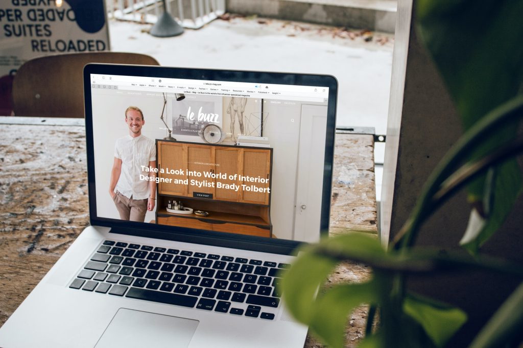
The landing page of your website is what the customers see when they first enter your page, and first impressions matter the most. The image on your landing page is what they will most likely pay attention to the most.
The generic quote, “A picture is worth a thousand words.” really rings true. And it will for sure affect the conversion rate of your visitors or potential customers, for the better or worse.
Also, one of the vital factors when building a website is choosing a good hosting service. We would love to advise you to take a look at WPMU DEV.
We love WPMU DEV Hosting most because it’s packed with unique and powerful hosting features you won’t find anywhere else (like 7 built-in pro-WP plugins). See for yourself and get 20% off any of their hosting plans here.
Making your landing page perfect and choosing the right picture for it is not as hard as it seems. You have to know a few things, to begin with, and we have the right tips to provide you with.
Avoid Generic Pictures

Using generic or stock images does not make you stand out from all the other pages. In fact, the sea of generic websites is going to swallow you, and you will be just one unexceptional individual in a crowd of millions of others. However, you can easily avoid that.
You can even hire an artist to create the perfect digital image to go with your site if you want something unique and one-of-a-kind. Make the image relatable because you want to attract a wide range of people. Make it general; otherwise, you will only appear inviting to a small group of people., and we advise you to avoid limiting your audience.
Keep it Simple
We’ve all heard the adage “less is more,” but it doesn’t apply to every situation. In this case, simplicity is the best option. Customers will be confused if you bombard them with far more information than they can handle. So, the solution is to put only the most essential pieces of information.
Don’t be scared that you oversimplified it, as they can always click on the links on the site if they are interested in finding out more about your product, contact information, etc. If the subject is more complicated, they can always contact you or your team directly. Harassing your customer with a slew of pop-ups and auto-plays is also undesirable.
Use HQ Images

To keep your visitors’ eyes glued to the page, use only pictures of the highest quality. Indeed, you would not want the customers to squint while trying to decipher what you thought when you choose that 300×300 picture to be the centerpiece of your landing page.
Besides, the best image will represent your product in the limelight it deserves. Whatever you’re selling, make it as appealing as possible and present it as something your visitors would regret missing out on at the time they saw it.
Harmonize Your Image With the CTA
Choose your image to fit nicely with the rest of the CTA on your site, like the links to your product, more information, or how the customers can reach you. Of course, the image is essential and should stand out on its own, but it is better to emphasize the CTA even more to increase your chances of selling your merchandise.
So, choose the image that stands out the most in the frame. However, do not smother your important links by making the image too distracting from the rest of your website.
Make It Look Professional

The goal here is to gain the confidence and trust of your customer the moment they enter your page. As a result, you don’t want them to visit a shady-looking website that appears to have been built in less than five minutes. Even if you didn’t, it has to appear as if you put a lot of effort into your page and personalization.
Properly presenting yourself is crucial, but making it look polished does not mean you need to keep it strict and formal.
Conclusion
In this article, we went through almost all the essential tips and tricks on settling on the best image for your website’s landing page. Also, we have mentioned some of the things that you should avoid if you want to keep the conversion rate of your visitors high. In the end, we have to say that the rest of the work that you have ahead of you should be a breeze.
It should only be a matter of your taste. The customers will judge your website at first glance as soon as they enter it. So, having a professional-looking, clean, and personified image of high quality that fits well with the rest of your webpage and serves its purpose is simply a must.