Linking pages on your website is essential if you aim to provide a good user experience. Additionally, adequately tagged and attributed links are good for SEO. If your goal is to motivate users to click on a specific link, then styling them in the right way is a good idea.
Links are most often divided into external and internal links. External links are those links that take users to a website that is different from the original website. Use internal links to link pages on the same website.
Keeping a user on your website could be challenging, especially if you need to add external links for one reason or another. One way to give users a heads up and keep them on your page is by showing a popup when the user clicks on a link.
This and much more are possible with WP Links, a swift, time-saving, easy-to-use WordPress plugin. Today we will speak about popups on link clicking, so-called exit confirmations.
Popups with WP Links
 After successfully installing and activating the WP Links plugin, head to the plugin settings. From here, you can control everything related to links on your website. You can set rules and visual formatting for links, create exceptions, and even check if links work correctly.
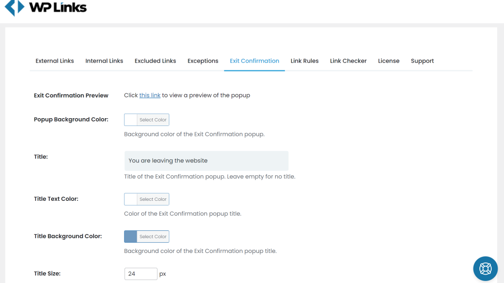
To create popups, head over to the Exit Confirmation section. At first look, it might seem like there are many settings. Don’t worry – the plugin works straight after installation, and these settings are there to customize the appearance of the popup – no need to spend hours on setting this up.
Using the Exit Confirmation tab
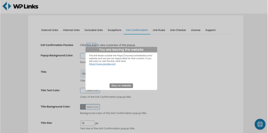
 Click on “this link,” and you will get a preview of the Exit Confirmation popup. Here you can see the default view – neutral colors with a link to the website user wants to go to, together with the ‘Stay on website’ button.
Colors and styles in the default view are made to fit any website. If you don’t like spending too much time on the visual aspect, look at textual content. You can edit the text displayed in the Exit Confirmation from the title, text, and button text sections.
Don’t write too much. Please keep it simple and give the user a reason to stay on your website. We will talk more about these reasons, but first, let’s see how to customize the style of the popup. Play a bit with the dimensions of the popup and test it on different devices, and make sure it is responsive and yet to fit the text you want to display.
Customize style
 Fitting the Exit Confirmation style to your website’s style is probably the best. With WP Links, you can do so in a matter of seconds! In the Exit Confirmation tab in the plugin’s settings, you can color settings for all of the elements shown.
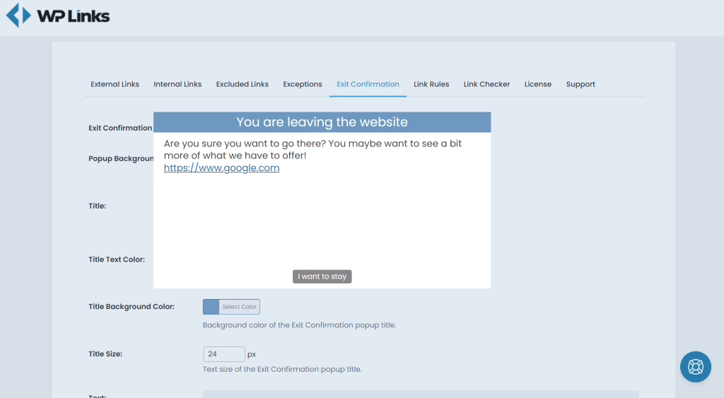
We decided to make a popup with a slightly bigger font and shorter text. To do so, we edited the text and button text fields. Next, we increased the title and text sizes in the labeled box. After that, do not forget to put the number in pixels for the size.
Ultimately, we wanted to use the light blue color for the title background, so all it takes is to click on the title background color, and the color selection pops up. Here we selected a color that we picked randomly. You will probably want to copy-paste the color code if you already have the primary color on your website.
After all the styling and adjustments, we ensured that our popup was responsive and that size was okay. Always make sure that you check how the result looks, and only after your test does it hit the save changes button. If you noticed that the overlay color didn’t fit in, all you had to do was to go back to the settings, change the overlay color, and hit save changes again.
Why is it important
Now that we have a fast and reliable way to put a system that will notify users when they leave your website, let’s revisit the motivation for this.
Besides the obvious, keeping the user on the website, there are plenty more arguments to warn users when they leave. You can use these also as part of the text in your exit confirmation.
Security on the internet is a big topic nowadays – you can control it for your website, but you cannot guarantee that the other websites will stay secure. Giving a reminder to the user that the content they are about to see is not under your control is an excellent way to keep you out of trouble.
Similar to the security, the quality of the information served on third-party pages is not under your control. Maybe you want to refer to an article you found on a topic your page is about. Nobody guarantees that this content will stay updated and truthful. Let users know that.
Even if the page you are directing the user to is entirely legit and secure, it might contain content unsuitable for minors or at work. This is called “not safe for work” content or NSFW. Make sure you warn the users if you link to such content.
Final thoughts
If you make changes to the settings, make sure you see the preview so you are sure that the preview looks the way you want. Match the popup style with the rest of your site with colors and text size for the best results.
Complete control of links on your website is a great way to improve the SEO and user experience and see the bigger picture. WP Links allows you to do all that, and, as seen in this article, it makes Exit Confirmations extremely easy to activate, adjust, and style.
This excellent plugin comes in both a free and a pro version, and both ways deliver stunning results. Try them out!