Imagine walking into a store where everything is jumbled up. Socks next to bananas. Headphones hiding behind frying pans. Frustrating, right? That’s exactly how an online store feels when product categories aren’t done right.
When you’re running an e-store, *organized product categories are everything*. They guide shoppers, help them find what they want, and encourage them to buy more. Let’s explore some simple and fun ways to optimize your categories for better navigation!
1. Start with the Shopper’s Mind
Don’t organize things the way you think they should be. Organize them the way your customers expect.
- Use words shoppers use.
- Think like a newbie. Not everyone speaks “tech” or “fashion.”
- Group items the way they’re used, not just how they’re made.
2. Keep It Simple, Seriously
Ever heard of the paradox of choice? Too many options stress people out. Make your navigation tree simple.
- Use broad categories and then break them down into subcategories.
- Keep the main menu short and sweet. 5–7 top categories is perfect.
- Don’t hide your best products deep down in rabbit holes.
Example: Instead of “Electronics > Personal Devices > Audio > Headphones > Wireless > Noise Canceling,” try “Electronics > Headphones > Noise Canceling”. Much faster!
3. Use Clear, Friendly Labels
Would you click a category called “Miscellaneous Tech Items”? Neither will your customer.
- Make category names short and specific.
- Avoid jargon only insiders know.
- Capitalize where needed. “Home Decor” is nicer than “home decor”.
Also, keep your naming style consistent. Don’t say “Smart Phones” in one category and “Cellphones” in another. Pick one and stick to it.
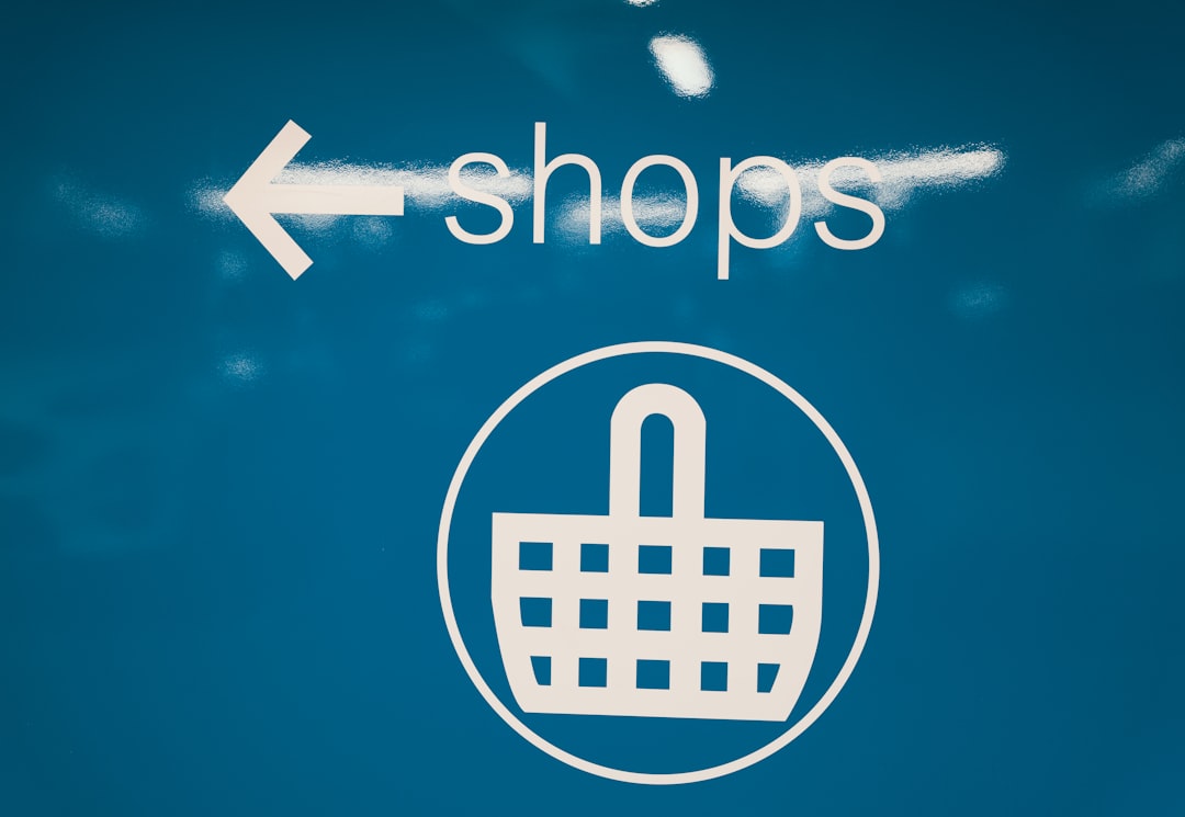
4. Make Navigation a Visual Journey
Text is fine, but humans are visual creatures. Spice it up with images!
- Use icons or images for main categories. A little t-shirt icon makes “Clothing” pop.
- Thumbnail previews for featured subcategories work wonders.
- Show hover effects that highlight clickable areas. It’s fun and functional.
5. Use Filters the Smart Way
E-stores aren’t just about categories. Filters help narrow things down quickly.
- Let users sort by price, brand, color, size, rating, etc.
- Place filters in a sidebar or top panel where they’re easy to see.
- Don’t overdo it. Too many filters can confuse shoppers instead of helping them.
*Bonus tip:* Always let users clear or reset the filters easily. Nobody wants to be trapped in filter limbo.
6. Search and Categories Go Hand-in-Hand
Sometimes users just want to type what they need. Your search bar should work with your categories.
- Display relevant categories in search results.
- Auto-suggest popular categories as users type.
- Highlight search matches in category titles too.
This way, users can hop right to the category they need.
7. Keep Testing and Tuning
No category layout is perfect forever. People’s behaviors change. Trends come and go.
- Use heat maps and click tracking to see where users go.
- Test different layouts (A/B testing is your friend).
- Survey your users. A simple “Did you find what you were looking for?” can tell you so much.

Wrapping It Up
Great product categories aren’t just nice to have. They’re like signposts in your store’s maze.
Simplify, guide, and delight.
When visitors can find what they’re looking for quickly, they’re more likely to stick around, explore, and—most importantly—buy.
So grab a coffee, review your store’s categories, and start organizing for success!